- About Me -

I’m a Graphic Designer based in Ottawa, Ontario. I believe in helping clients by bringing your ideas to life and creating unique designs. No matter what kind of medium it is, I will work with you to achieve it.
I have many other interest other than graphic design. Like animals, traveling, baking, movies, watching Youtube and many other fun things.
- My Work -
Outdoor Summer Days' (Brosmind Inspired)
Illustration
Outdoor Summer Days' Brosmind Inspired
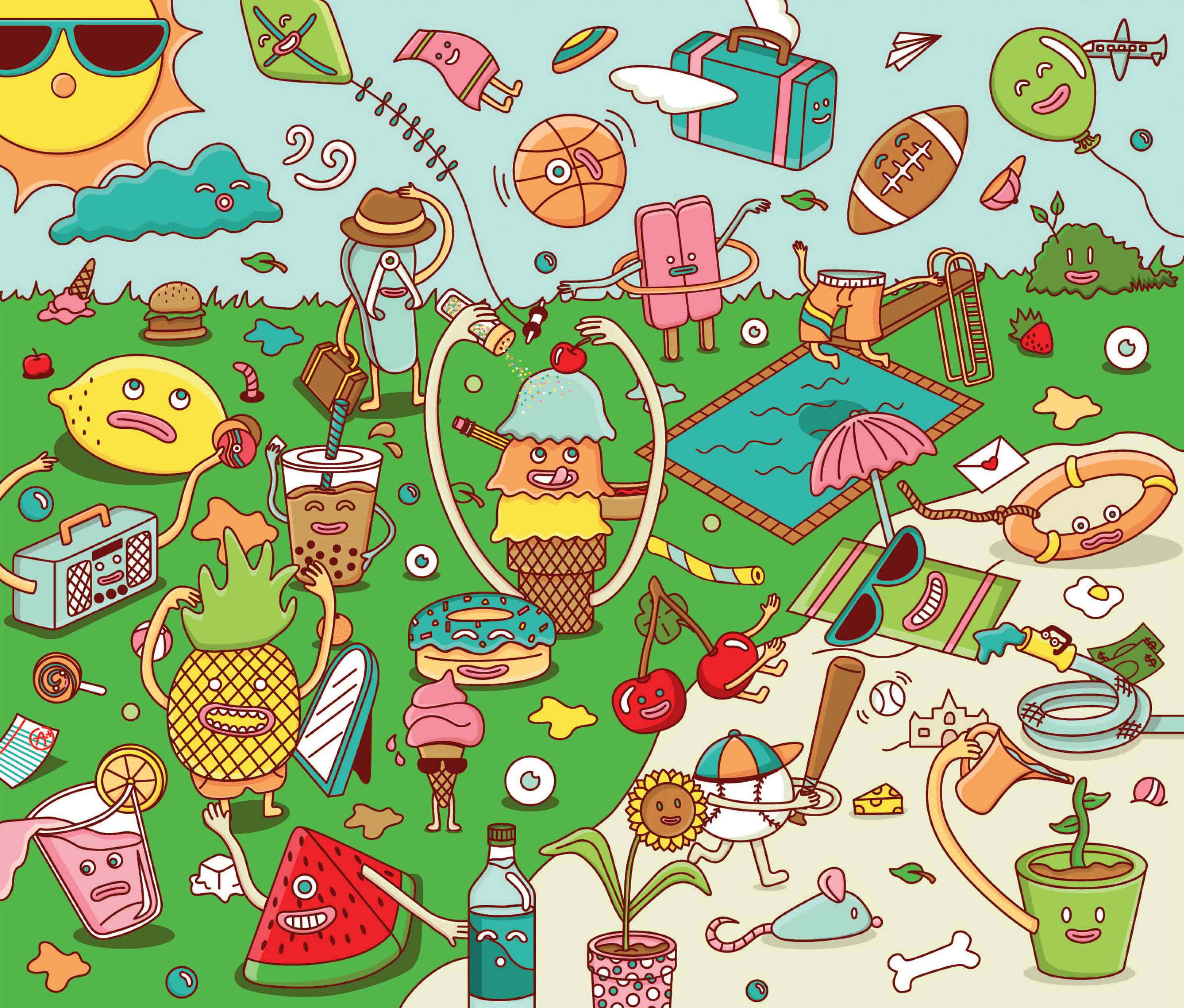
This Brosmind inspired piece is a very busy, crowed, colourful and playful illustration piece. It was inspired by the warm summer sunny days and outdoor summer sports; with many objects coming to live there it makes this piece a fun piece to look at. Each character has an unique feature. It was designed according to what the character was. For example, the baseball character is hitting a baseball with a baseball bat.
Process
It started out with picking a theme. Then it was coming out with creative fun characters placing them in a scene. Throughout this process, there were a lot of sketches. After that it was hours and hours and hours of work on Adobe Illustrator.. The details on the characters bring more life to it and gives the scene a light source.
Challenges
The challenge was to make a busy scene. Having to come up with enough interesting characters, every one of them had to be unique and carries a fun personality. Each character has a lot of details added to it, by putting a light shadow for the reflected light and a dark shadow to bring the character to life.

A Normal Date (Josh Agle Inspired)
Illustration
A Normal Date Josh Agle Inspired
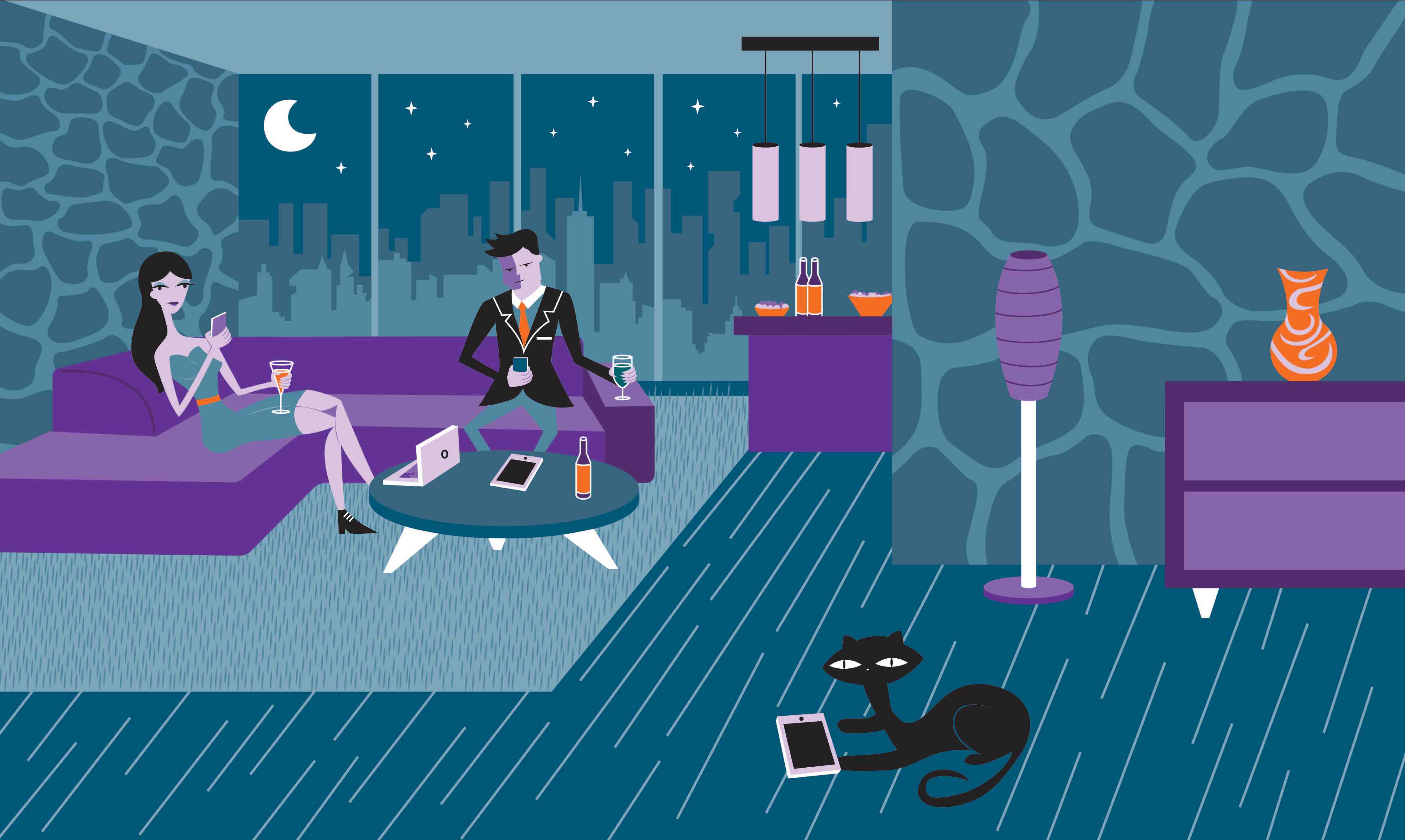
This illustration inpired by Josh Agle, is a fun illustration that shows a couple on a 'normal' date now a days. It is how I would imagine happen to some couples with the technology and tech gagets created.
Process
It started by researching about Josh Agle and his work to get the feel and style. Then a lot of sketching and were done to have to perfect layout for the illustration. Then it was brought onto Illustrator to create the scene.
Challenges
The challenge was to create/design with only a few colours. The ojects in the scene camn not be blended in with other ojects. The character had to be Josh Agle style or it would not look like a Josh Agle inspired piece. Another challenge was to have the perspectives right. Having the perspective not matching the scene with make the scene look like things are falling apart.

Flight Time App
Motion, UX/UI, Material Design
Flight Time App
The Flight Time app is an app that helps users create a better exprience waiting at the airport/taking a flight. This app helps ease the user while they are waiting at the airport by knowing when to catch the flight so they won't panic. It would create a better exprience going on a trip for the users.
Process
The Flight Time App started out as a simple project with the idea of having to wait at the airport and have nothing to do and being afraid to explore. Sketches and prototying was done to create the perfect expirence for the users.
Challenges
The challenge was to make the app flow simple and easy to follow while having all the features that is needed. It is important to have the flow perfect for users to have a good user experience.

CHEO Annual Report
Typography, Graphic Design

CHEO Annual Report
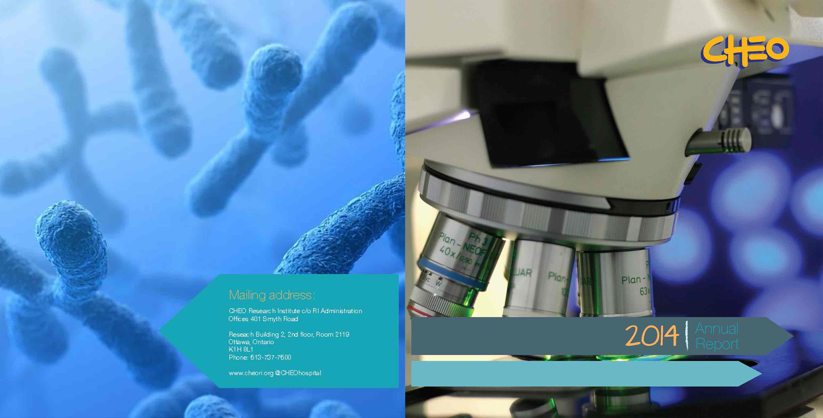
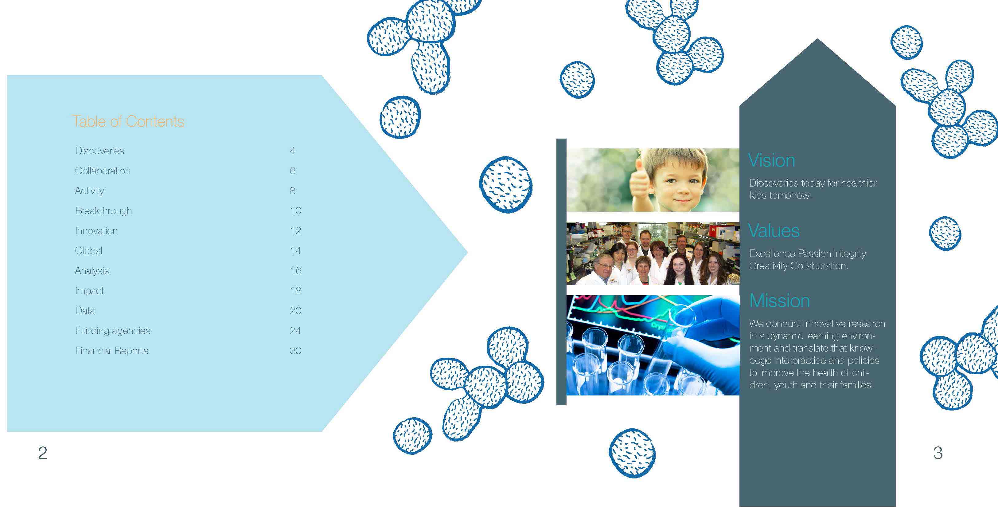
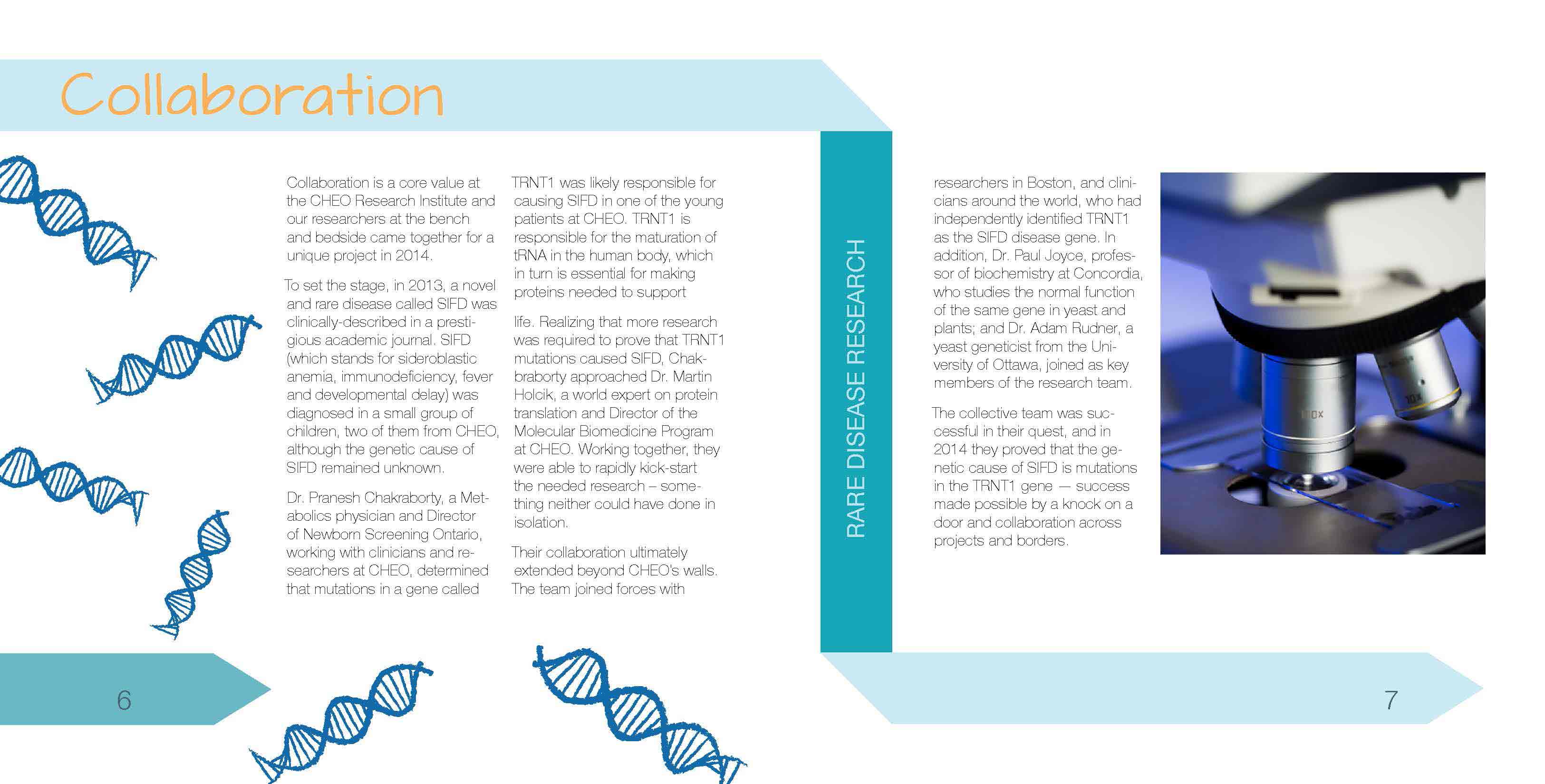
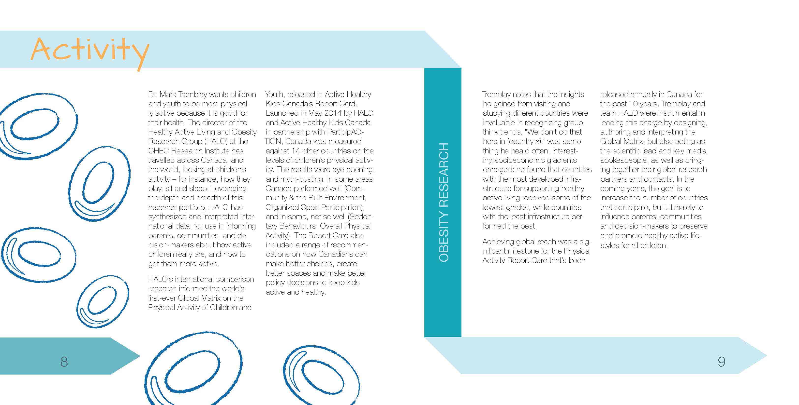
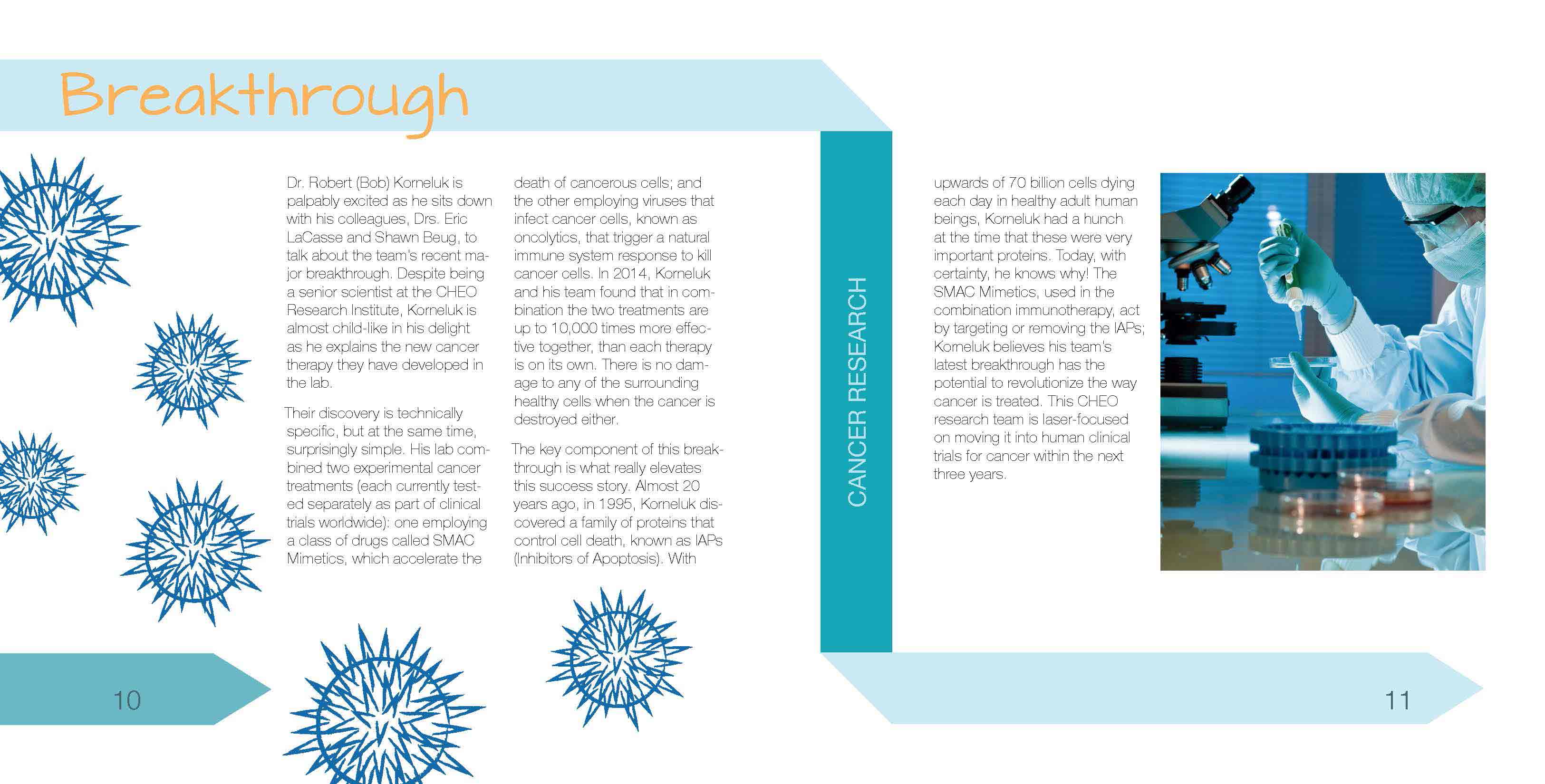
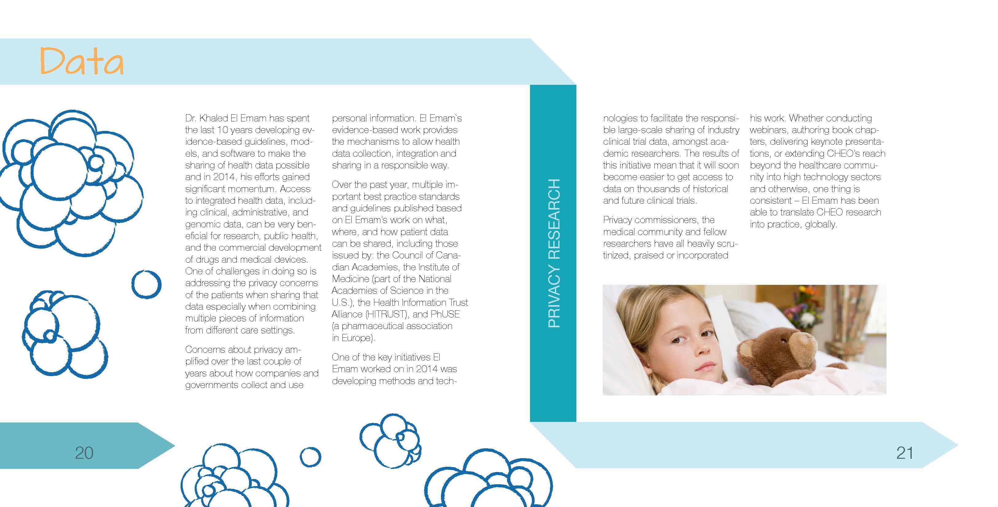
This is a anuual report for CHEO (Childern's Hospital of Eastern Ontario). This report was designed to have the report simple and easy to follow along with some intersiting illustrations to make the book look interesting and more fun to look at.
Annal Report Pages

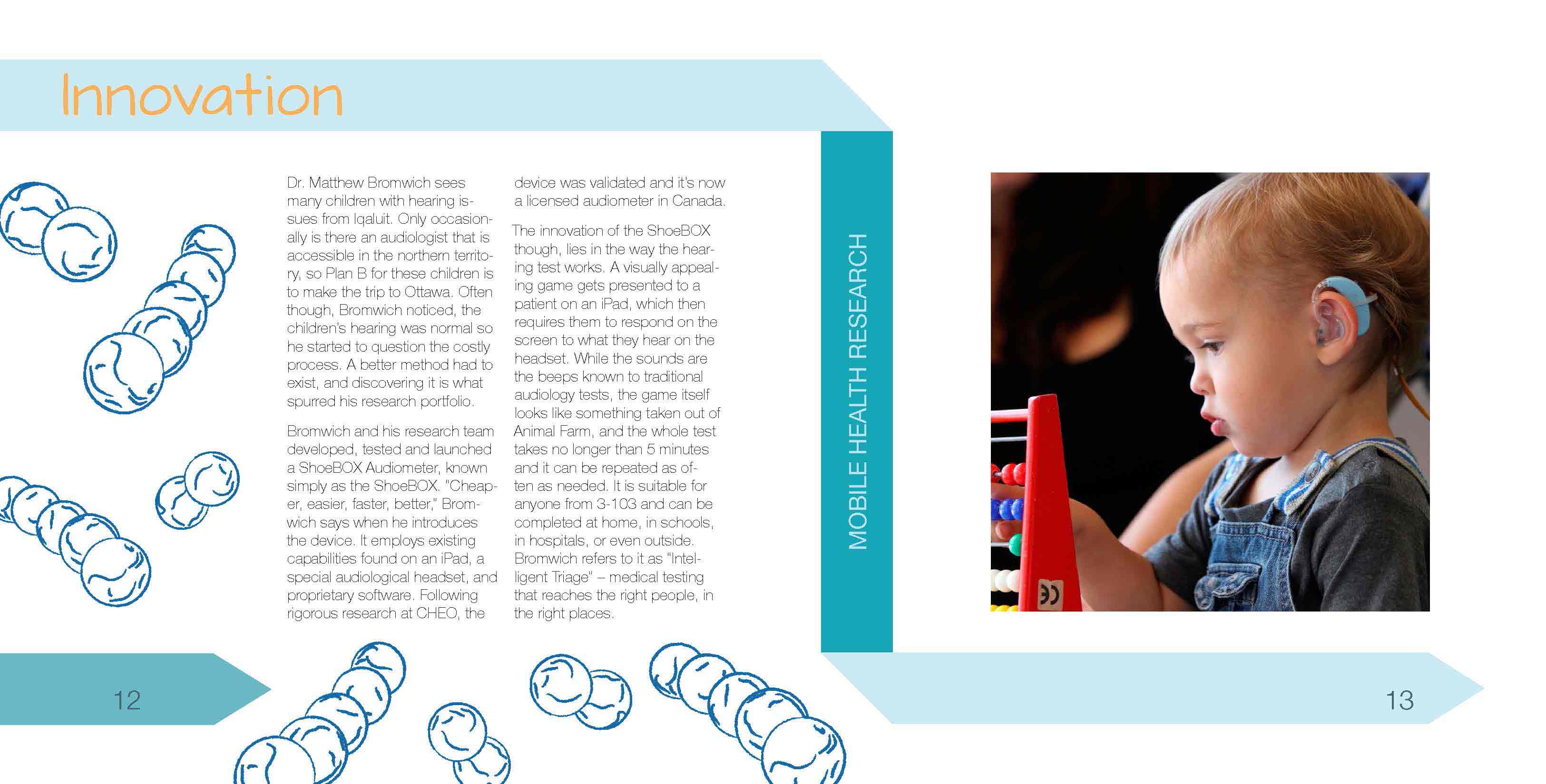
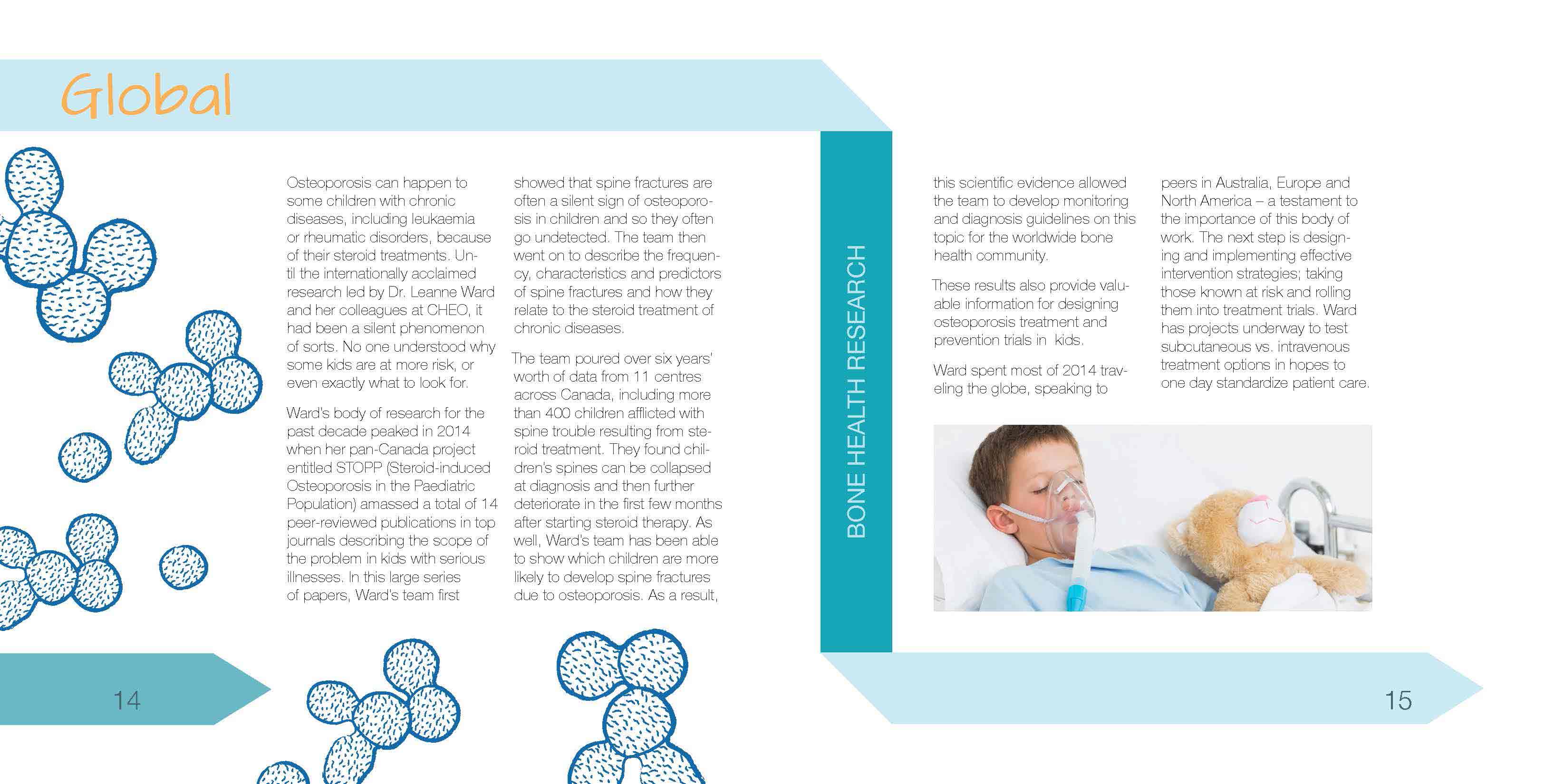
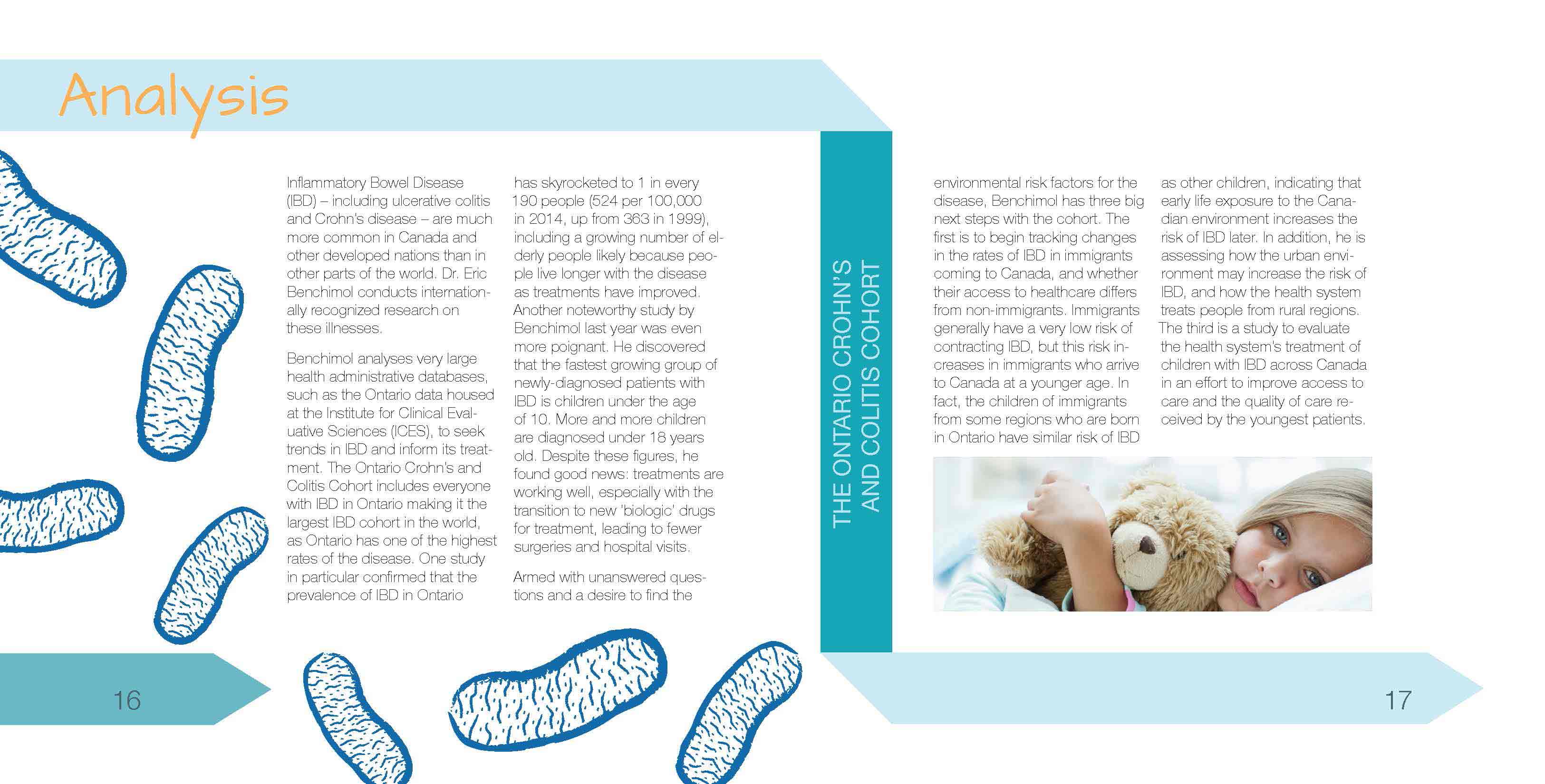
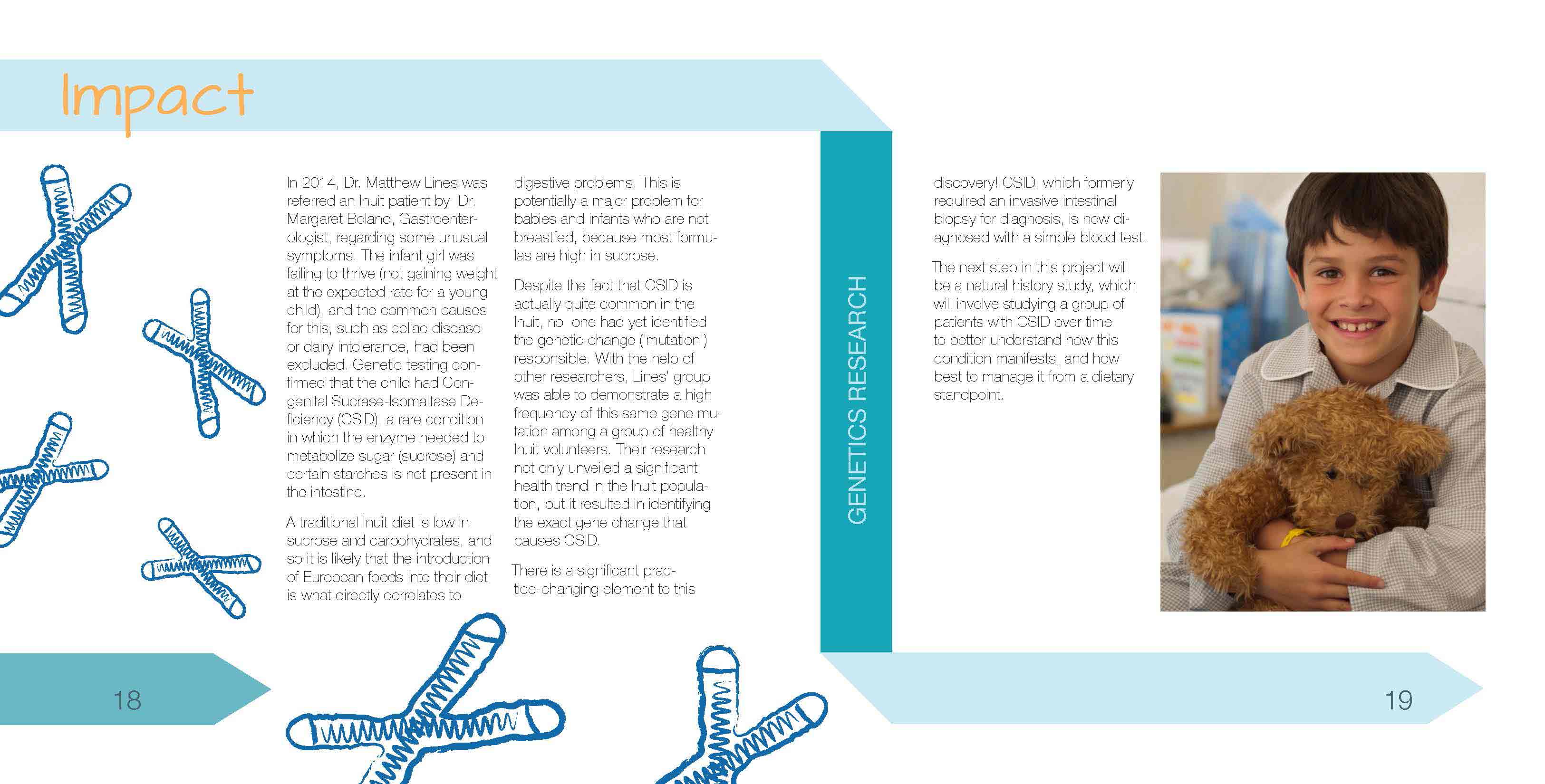
Challenges
The challenge was to have a good interesting layout and type layout that catches people's attention. While having an interesisting layout, it also had to have a good flow for people to follow and for accessibility reasons. Since this report is in French and English, it was hard to balance the type for both languages.
Doughnuts! Quote
Motion Graphics, Parallax Animation
Doughnuts! Quote
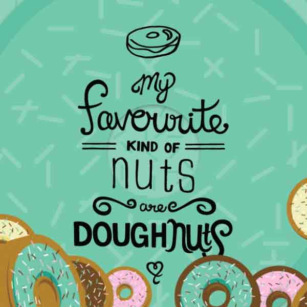
This parallax motion video is base off of a quote that many doughnut lovers say. It is a colourful fun short video to share with friends and families.
Process
This motion project started out with the quote lettered out in pen and ink, base off of how I liked doughnut and how I was craving it. Lots of sketching was done before going into this motion piece, like project for motion or any kind of project. Then storying boarding to figure out what each scene will look like.
Challenges
The challenge was to to get the doughnut falling naturally. It took awhile to get use to playing around with the keyframes to get the timing right.
Bubble Tea Factory
Illustration, Isometric Dssign

Bubble Tea Factory
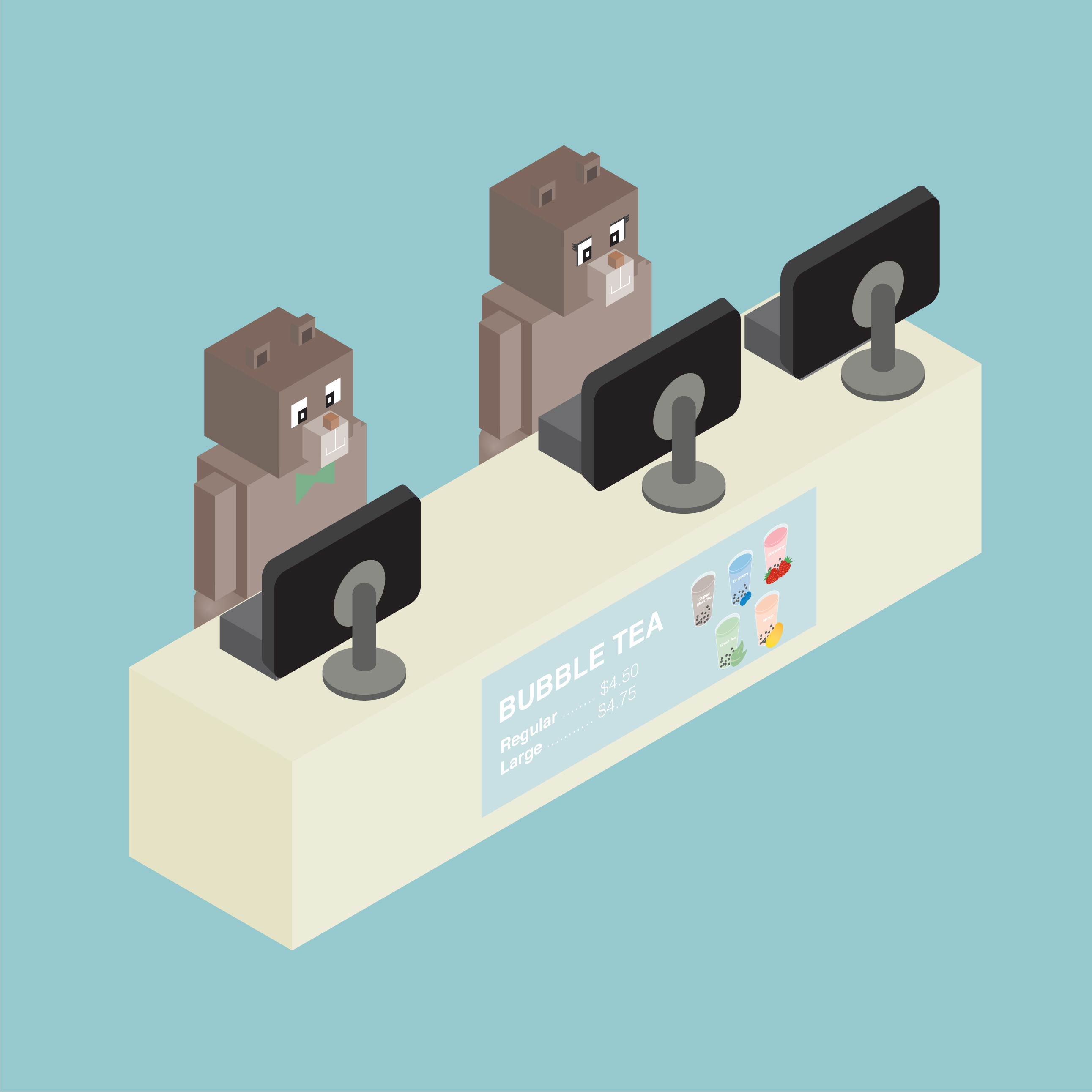
This fun illustration is inpired by the fact that I really like the drink bubble tea and I was craving for it. In the illustration, it shows the process of making bubble tea. The fun cute, boxy bear characters gives the scene a sense of movment. Oh for those who don't know what bubble tea is, it is a drink from Thaiwan. The drink is usually mixed with black or oolng tea with milk and sugar and tapioca purls, grass jelly or fruity jelly.
Process
When I started this project I had to chose to a theme or a process, like making coffe, cupcake, or sushi. Then I made lots of sketeches to get the layout. Then It was put into Adobe Illustrator.
Challenges
The challenge was to have every square, rectangle, circle to snap to each other so there wouldn't be a space.
Mini Yogurt Bites
Stop Motion, Motion Grpahics
Mini Yogurt Bites
This instructional motion video is a fun short video that shows you how to make frozen yougurt bites, great for the summer. This video includes step by step intstructions by using stop motion.
Process
This project started with figuring out the scene and the layout of the scene. Then taking a photoshoot. A lot of planning and prep work that had to be done befor the video. There had to be a good flow of the scene with different angles and scene layout.
Challenges
The challenge was taking the photoshoot. Since I was working with frozen/cold food it had to be done quickly. You wouldn't want to have the food go bad. The hardest part was thaking the photos of the finished product. You would have to work extra quick before it melts!
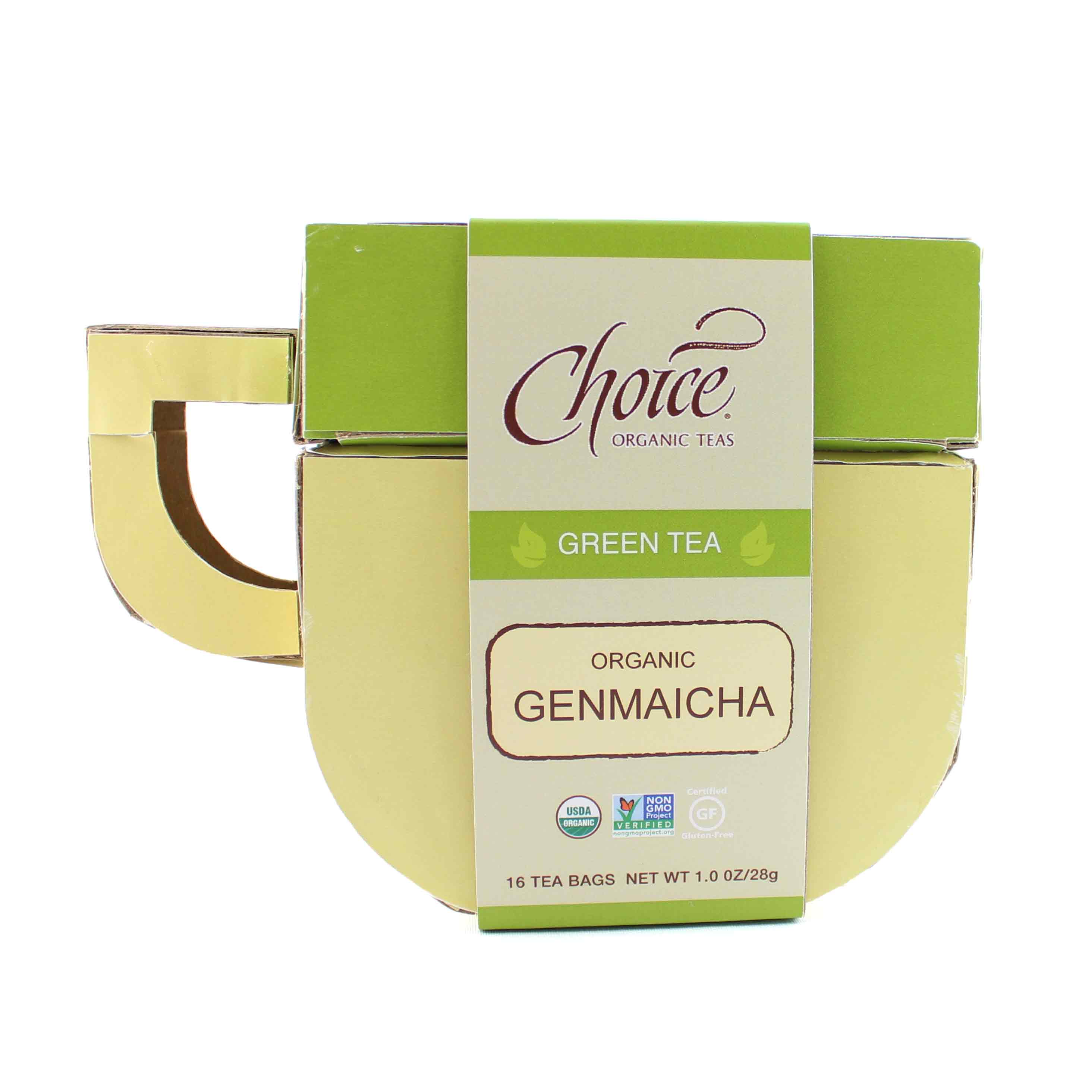
Choice Organic Teas Repackaging
Packaging, Branding

Choice Organic Teas Repackaging
This Choice Organic Teas Repackaging design has a fun shape to look at and to have. The Packaging is supposed to have a oranic feel to it with the green organic colours that were used.
Process
It started out with picking a theme. Then it was coming out with creative fun characters placing them in a scene. Throughout this process, there were a lot of sketches. After that it was hours and hours and hours of work on Adobe Illustrator.. The details on the characters bring more life to it and gives the scene a light source.
Challenges
The challenge was to have the measurements right. It was important to know how the package is being build. A lot of prototypes where done to ensure the packaging works.

